Hi Flyers!
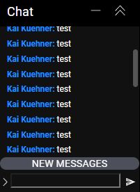
Just wanted to let folks know that we made a small chat update that should help with reading past messages on FlyWire chat. A new messages indicator has been added. You can also click on it to scroll to the bottom of the chat window.

Hi Flyers!
Just wanted to let folks know that we made a small chat update that should help with reading past messages on FlyWire chat. A new messages indicator has been added. You can also click on it to scroll to the bottom of the chat window.

I have a bug on that, doesn’t happen always (I can desktop vid if you want/need for the devs) where when i click that button and it gets me to the most recent msgs the “NEW MESSAGES” button doesn’t vanish.
I’ll let the devs know. Thank you!
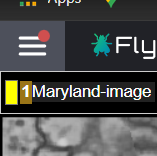
For example: here I have pressed the button, i am on the latest most end of the chat/msgs, button wont leave and if i close the pane (burger icon up left) then that button has a red dot as if there’s msg(s) i’ve missed/ not read.

And this should be fixed now! Let us know if there any further issues.
Seems to have been fixed! thnx!
Hi Flyers,
You’ll notice that the colors in FlyWire chat have been updated to more closely resemble Eyewire’s chat. Admins are now their usual golden color, researchers are green and Flyers (Eyewirers) are now a teal blue.
If you’re in the Top 3 on the Leaderboard, you’ll now see a medal emoji ![]()
![]()
![]() next to your name!
next to your name!
Cheers,
M, Kai + Eyewire HQ
I like the update. I see, that also the width of the Leaderboard has been fixed.
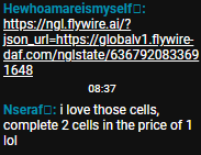
The only minor issue, is that on Windows (8.1) and Chrome (103) instead of the medal emojis there are blank rectangles:

Firefox (102) on the same system works fine.
yeah, nice lil’ update, the gold colour for ppl 1st in leaderboard was throwing me off (eyewire legacy ), nice to see the GMs back at their usual colour lol, and the leaderboard needing scrolling left right was a pet peeve lol.